Paper Trails at the Bus Stop: Reading a Town Through Its Noticeboards
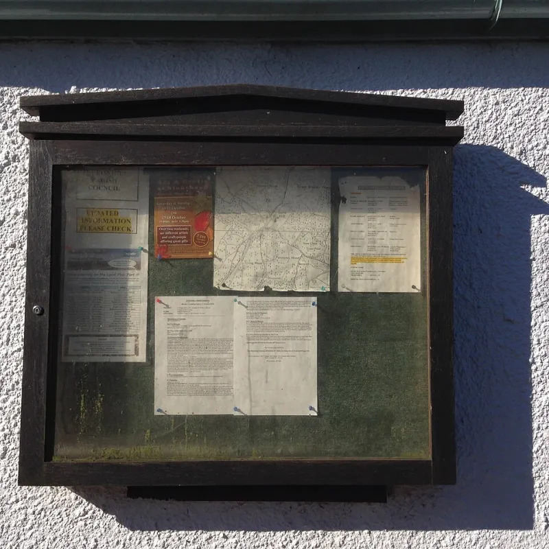
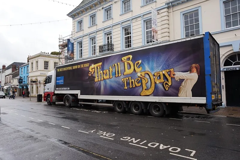
Photo: James Harrison , CC BY-SA 2.0, via Wikimedia Commons
I started the lamppost archive by accident. I was waiting for a bus that did not come, standing under a tree beside a noticeboard that had been stapled, taped and rained on so many times it looked like a collage. There was a yoga class, a quiz night, a missing cat, a tribute act, a church fete and a poster for a play I had never heard of. The play had been on three weeks earlier. Nobody had taken the poster down. That felt like a whole essay about local culture, so I started taking photographs.
The noticeboard as a local newspaper
A good noticeboard is not a tidy grid. It is a conversation with bad lighting. In one town I found a library reading group, a repair café, a brass band looking for players and a call-out for someone to run a Saturday art club. In another, the same board was mostly takeaway menus and a handwritten note about a lost glove. The difference was not money. It was whether anybody had taken responsibility for the board as a place where things happen.
The flyers that survive are usually the ones that answer three questions fast: what is it, when is it, and where do I go? The ones that vanish into the mulch are often the most interesting. A new-writing night with a beautiful hand-drawn poster and no venue name. A scratch performance with a QR code and no other information. A workshop described in language so careful and abstract that you could not tell whether it was for children, adults or people who had already done an MA in it.
What gets promoted, and what gets left in the rain
Town centres promote what already has a habit attached to it. Quiz nights, coffee mornings, tribute bands, school fairs, church services and anything with a raffle. These are not lesser events. They are events with a known shape. You can picture the room before you arrive. A flyer for a quiz night does not have to explain why a quiz night might be fun.
Small performance struggles because it has to explain itself from scratch. A play without a familiar title, a dance piece in a church hall, a clown show in a shopfront: these need a sentence that does the work of a whole poster. The best local flyers I have photographed do that with alarming economy. One said: come and watch three people try to build a boat indoors. Another said: stories from the bus route, told by people who use it. I have no idea if the shows were good. I would have gone to both.
What gets overlooked is often the quiet stuff. Access information. Content notes. The fact that you can pay what you can. The fact that the venue has a step. The fact that the show is forty-five minutes long, which matters enormously if you are arranging childcare or a lift. These details are not admin. They are part of the invitation.
The lamppost is not a distribution strategy
I have seen beautiful posters wrapped around lampposts in the rain, flapping like a bad idea. I have seen flyers in shop windows so high up they need binoculars. I have seen a stack of A5 cards on a pub windowsill, slowly curling into a paper croissant. Paper is not dead. But paper in the wrong place is just litter with good typography.
The places that work are the places where people queue, wait or linger. The library desk. The co-op noticeboard by the exit. The leisure centre reception. The café that lets you put a card in the window if you buy a coffee. The bus shelter, if it is dry. The church hall porch, if the vicar has not given up on humanity. A poster where people walk past is a poster. A poster where people stand still is a conversation.
What I would do for a small show in 2026
First, make one image that works at the size of a thumb and the size of a window. If it only works as an A2 print, it is not an image. It is a mood board.
Second, put the date and venue in the biggest type, then the title, then the sentence that makes someone curious. Do not make the audience decode the font to find the postcode.
Third, print fewer flyers and put them in better places. Twenty flyers in the right café, library and leisure centre will beat two hundred shoved under windscreen wipers. Ask the venue what they will display and when. Ask the library if they have a local events board. Ask the co-op manager nicely. Ask the pub if you can leave cards after the quiz.
Fourth, make the paper match the digital. If the poster says one thing and the ticket page says another, the audience will trust neither. Keep the title, time, venue, access info and ticket link identical everywhere. Boring consistency is a kindness.
Fifth, include a human sentence. Not a tagline. A sentence. Something that tells a stranger what it will feel like to be in the room. The lamppost archive is full of posters that list a genre and a price and nothing else. The ones I remember gave me a small, specific promise.
The archive keeps growing
I still photograph noticeboards when I am early for something. I have a folder of church hall posters, library flyers, handwritten cards and one laminated sign for a dog show that I think about more than is reasonable. The archive is not a survey. It is a sketchbook of how towns talk to themselves. It shows who has a budget for colour printing and who has a photocopier and a marker pen. It shows which events expect an audience and which are still hoping one might turn up.
And it shows something useful for anyone making performance outside a city centre: the paper trail is not the whole story, but it is a map of who is already listening. Put your show where people are already standing. Make the sentence worth reading. Then take the poster down when it is over. That last bit is not art. It is manners.